laundry room makeover

our laundry room is finally complete.  it only took us four years to do it.  but it's done.  and i love it.

when we built our house we had the option to have the laundry room upstairs but opted for an office instead.  this meant our laundry room was relegated to the basement.  not a big deal, but there were a few things i wanted to make sure it had.  number one was making sure that it was a separate room from the utility room, which we did when we finished the basement.  we also tiled the floor when the carpet went in.  and that's pretty much all we did for about a year.  added a walnut counter top a year later and then haven't touched it since.

here's our laundry room before ... boring and blah.


there wasn't a lot left to finish in the laundry room, i mean we tackled the floor and counter top early on.  but we were lacking practical things like storage, somewhere to hang our ironing, and somewhere to lay things flat to dry.  you know things that you might actually use a laundry room for.  i also wanted it to look nice and have some visual interest, meaning it also needed some tile.

it's amazing what a few afternoons, a trip to ikea and a tile saw can do for a small space.  have a look at the progress we made in just two afternoons.  (just required a little bit of creative parenting skills, playdates and snacks to make it happen)


/ cabinets

yay!  we have storage and can actually lay things flat to dry on our counter.  or use the counter to fold things.  imagine that.


i love love love this tile pattern.  i didn't want to do a subway pattern with these 3x6 ceramic tiles ... too predictable and we already have some of that going on in other parts of the house.  this is kind of the same same but different.  

um, i also did some of that there tile pattern.  for some reason i have this strange desire to know how to lay tile.  i wanted to do it in our last house, but was too pregnant to do when it came time to actually do it.  the laundry room wall tile was a great first tile project.  it was easy to do and it didn't really matter if it got screwed up.  floor tile on the other hand would be a big deal if it got messed up.  

and now for the big reveal ... 


so happy with how this mini room turned out.  it may not be the largest laundry room, but it's functional and visually appealing.  which is way more than i can say about what this room looked like when we moved in.  think concrete floors, dry wall and a washer and dryer.  

with this room done, it's time to focus on our basement bathroom.  stay tuned.  


linked to : thrifty decor chick


bathroom ideas: clean and simple

Simple, clean and white.  These are the words that come to mind for our basement bathroom reno.  Which I guess isn't a reno, it's more a "let's finally fully finish our basement after four years."  As we gear up to finally complete this project I've had an excuse to browse for clean and simple bathroom inspiration.  And let's face it, that basically means spending hours on Pinterest.  Each one of these bathrooms has elements I love and helped me nail down a plan as we move forward.


Floating Vanity and Round Mirror


I love the mix of the hard edges of the floating vanities with the rounded edges of the mirrors.  Ironically each of these also contains my love of hexagon tiles as well.


Simple and white


 I love the idea of a simple and very neutral colour palette ... white and natural wood tones.


Contrasting Floors


Although I love all white, I also love the idea of a contrasting floor.  It adds a little bit of drama.  


Each of these beautiful bathroom design helped me come up with a design plan for our space.  Can't wait to get things started.


For more inspiring bathrooms visit here.  Happy Monday.


a room for family: part three

the "let's break shit and then make it beautiful" part.  now,  had nothing to do with this.  i provided some consultation about lighting and we had a shopping trip while demo was going on. but i did none of the sledge hammer swinging or break a wall apart.  i hope to one day.  its something i've secretly always wanted to do.  just bust a hole in a wall without consequence.  kira and dave took care of that for this room.

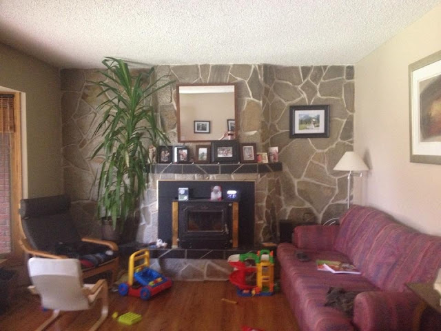
just a refresher here's what we were working with before the sledge hammers came out.


i don't think anyone was going to be sad to see that lovely rock wall and wood burning stove go.  it's removal instantly made the space feel much larger and open.

have a look for yourself.

a room for family: part two

also known as the design plan.

this is my favourite part.  the designing.  the coming up with ideas.  the drawing.  the sourcing.  all of it.  every. single. moment.

this project was a lot of fun to work.  scary because it was like, for real.  but totally, completely, fun.  not only was it for people i knew, but it was also the first design that i was going to give to real people.  i've only ever created spaces in my own home or for design school assignments.  sure i've suggested paint colours to neighbours and family, but this was a full design.  this was effing exciting.  i did my first sketches the afternoon she texted me the pictures of her living room.  within about an hour i had done my first sketches, sent them to her and the rest is well ... history.


we started discussing things over text message for a few days and decided that coffee and a site visit were going to be necessary.  being in the space really changed how i thought about it.  you can only tell so much from a photograph.  we talked about what they wanted for the space, what they needed, their style, and what to do with the interesting rock wall they had going on in their room.  i took a few measurements, wrote some things down and that was that.  first client project was on it's way.

kira and dave weren't in any rush to get things started which was totally great for me.  i slowly worked on drawing the space to scale, experimented paint chips, floor plan ideas and then life took over.  funny how that happens.  any way, fast forward a year and they were ready to start talking demolition, pot lights, and coffee tables.  shit just got real.  

here's the plan i came up with.  


pillow (similar) // coffee table // rug


i also needed to find lighting for the space.  one of the requests was for a ceiling fan because the room gets so hot in the summer time.  there was also a need for more light and so three pot lights were added in above the fire place.


it only took a year of planning.  but there was now a design in place and the demolition could begin.  there were revisions and questions along the way, but for the most part kira and dave did the shopping and sourcing for some of the items.  it was a great collaborative effort.  


up next, part three: demo and progress


organized creativity

as a mom of two small creative humans, we have an endless supply of unique, sometimes holiday themed, art.  and i'm fairly certain that many of you can relate.  so. many. crafts.  and while i love that my children explore and experiment with their creative side, there are only so many pieces of art that i'm willing to have in my home at one time.  over the last two years our craft creation has doubled in production.  we only have so many walls.  i also struggle with putting their creations in the recycling bin.  i want to keep all of it.  every single santa, mitten, half coloured picture. keep it. because they won't be little like this and we won't always have an endless supply of shaving cream glue art, aka puffy paint.  the realist in me will never allow this to happen.  instead of having my home turn into the children's art museum and then force myself to recycle art i didn't want to, i came up with a solution that let's me have my cake and eat it too.


first: figure out a way to display what they've created and not have it take over our house.  while i love to display what both future artists have created i don't necessarily want it everywhere.  my solution for this was to designate two specific areas for kid art.  a wall in our family room and a photo wire in our pantry.  by only having two designated spaces for their all their masterpieces, we can rotate the gallery as new pieces arrive and recycle older pieces.  i try to de-clutter our art galleries every few weeks. up until a few days ago we were still rockin' a pretty sweet santa and a couple christmas trees.


second: i don't want to just get rid of what they created.  one day when the kids are too busy to do arts and crafts i wish for all the pieces they once made and i'll kick myself for getting rid of all of it. the struggle is real.  on the other hand, i also don't want my attic full of never ending boxes full of twenty year old art.

i recently started taking photos of each art project they've done before i put it in the recycling.  i'm in the process of using the photos to make a photo book.  i use the program in iphoto.  i like it for two reasons.  easy to use and the quality is really good.  i use it every year for our photo calendar and have a couple books.  once i get to about twenty-five pages i think i'll get it printed.  by making an art  photo book i get to keep all of the art, without actually keeping all of the art.


happy friday!